Home / SFF / Design a Presentation
Stage 8
Design a Presentation
Warp to...
Design 101: The Presentation
- Review all design concepts from Stage 7 (Create a Poster)
- The KEY to a good presentation is movement.
- It's all about movement.
- "Movement is life" --World War Z
- People will last only about 4 seconds waiting for a website to load, and if it doesn't load by then, they'll move on.
- Movement has to happen every 5 - 10 seconds in your presentation.
- A slide changes
- Text appears/disappears
- Images appear/disappear
- This example (cut down from a full presentation) has FIVE times more movement than slides.
- 11 slides
- 50 movements.
- This full example (from a PCA presentation) has (coincidentally) FIVE times movement as slides
- 25 slides
- 124 movements
- That's one movement every ~7 seconds.
- Control the flow of words on screen
- No more than 30 words on screen at any time
- When words appear, discuss those words.
- People WILL read ahead rather than listen to you talk, so control text flow.
- All text must be bulleted and fragmented
- No full sentences
- You should be able to speak 1-3 sentences per bullet point.
- However, quoted material must be on screen word-for-word and read outloud word-for-word
- Have an image on every slide
- Images keep the audience focused
- Images keep their eyes off of you
- If using Graphs and/or Tables
- Explain Graphs and/or Tables the MOMENT they appear.
- Don't wait.
- Sources (at least 1 per minute)
- You should be quoting or paraphrasing sources at least once per minute
Template for the Presentation with Examples
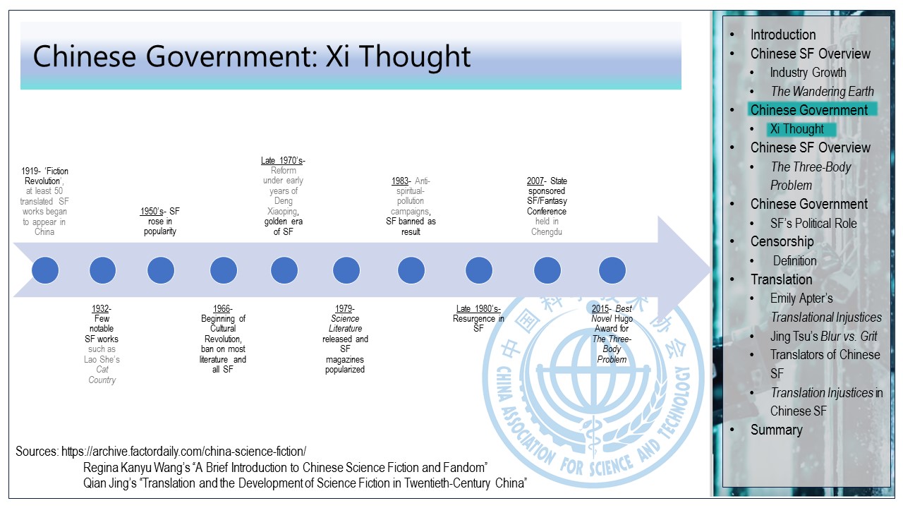
- We use a flowing table of contents (TOC) for all presentations.
- The TOC is on every page after the title and informs the viewer of
- What was discussed
- What is being discussed
- And what is next
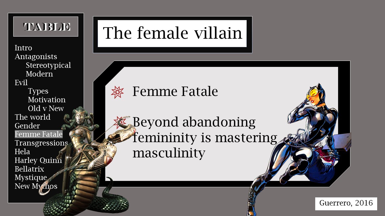
- Left Side TOC
-
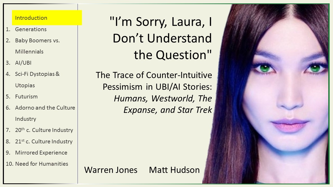
- Enumerated Left Side TOC on title slide
-
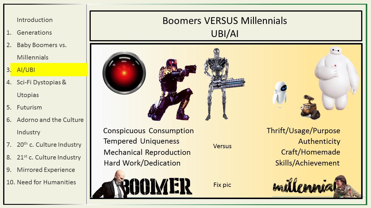
- Enumerated Left Side TOC in presentation
-
- Right Side TOC
- (Layout: Usually TOCs are on the left; she chose right-side because many asian languages are traditionally written top-down right-to-left)
- Bottom TOC / Title slide
-
- Bottom TOC in presentation
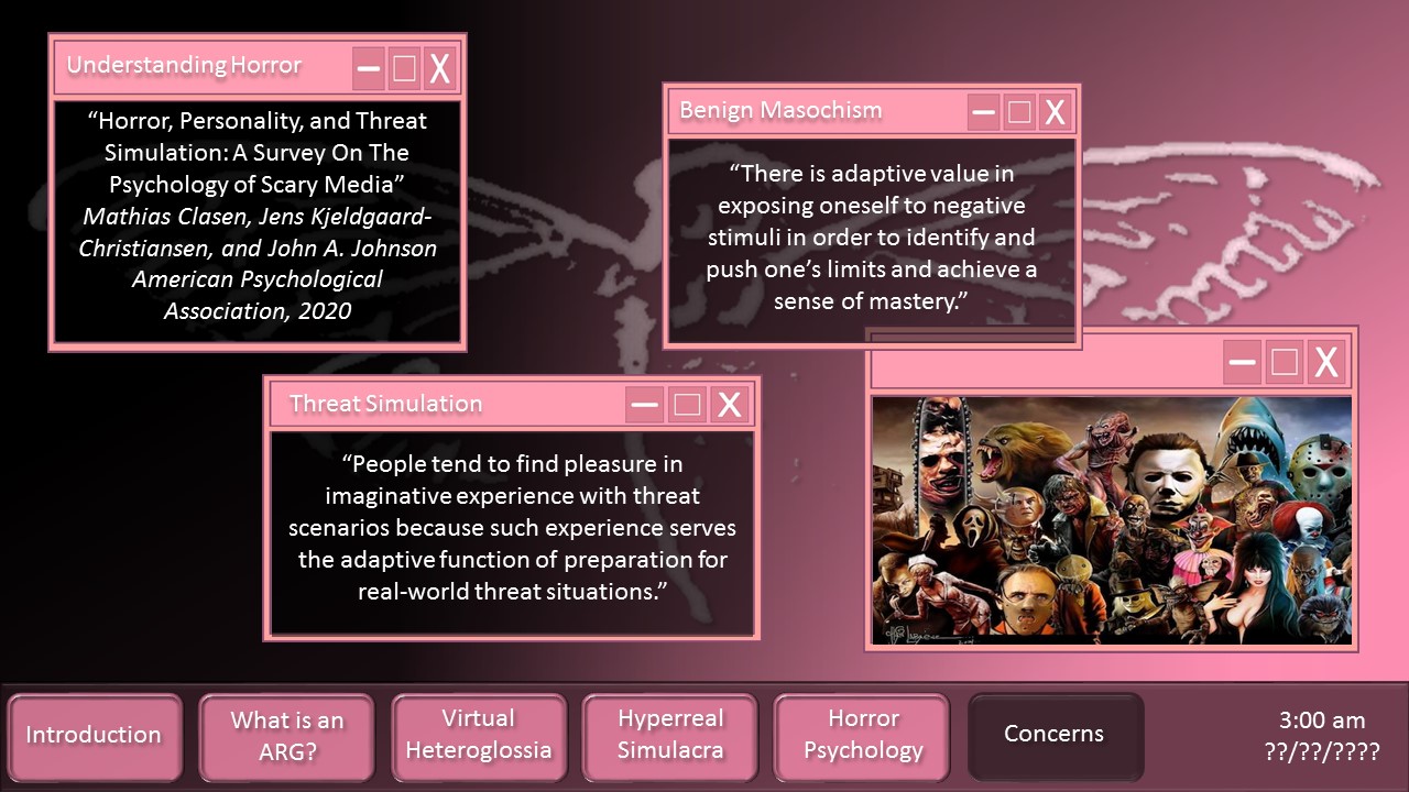
- (Creates a conceit of a desktop and uses the "taskbar" as a TOC)
-