Home / SFF / Design a Poster
Stage 7
Design a Poster
Warp to...
What is postering
- In the area of academic conferences, postering is for Graduate Students (Masters and Phd) and, depending on the conference, sometimes undergraduates.
- When postering, students stand next to their posters for a given time slot (usually an hour) and people can approach and have a conversation with the student about their research.
- Science Fair in Elementary Schools are meant to mimic Conference postering to prepare young minds for later academic research work.
- There are a lot of websites that discuss how to create an academic poster.
- Don't listen to them.
- Instead, listen to those who are on the cutting edge of the moment to change posters.
Create a Poster: Design 101
- Layout and design can take years of course work and practice to master.
- Layout and Design is NEVER about what looks cool.
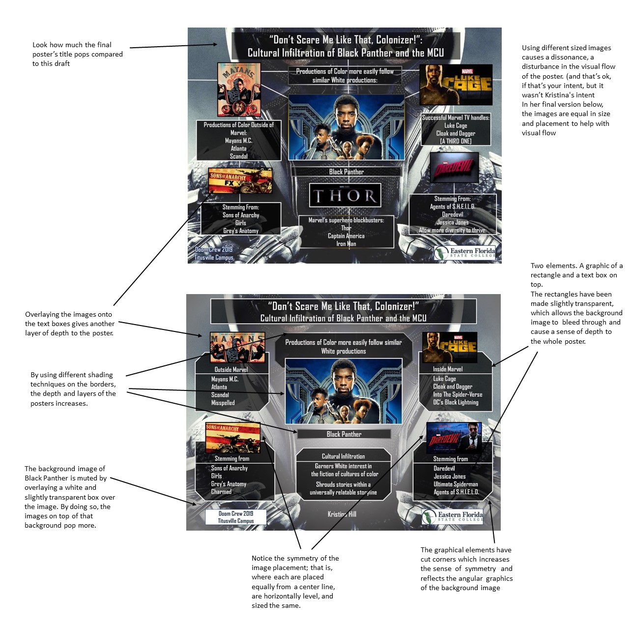
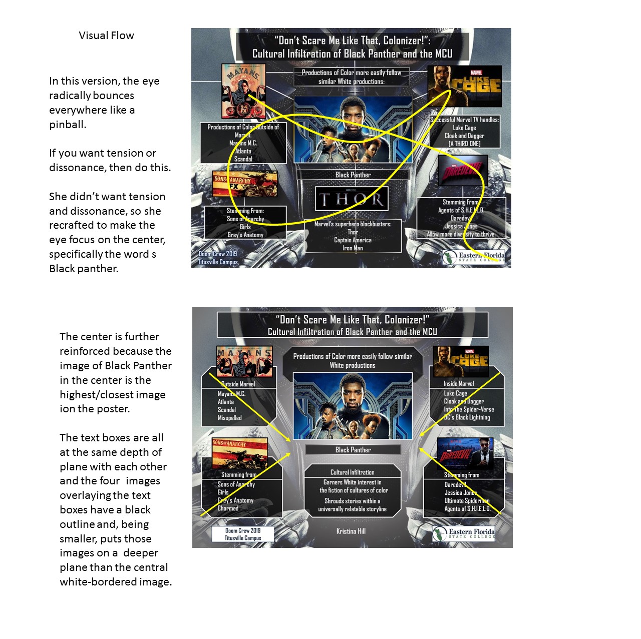
- The overarching principle for a poster should be that every element (text, image and graphic) must have a REASON for its placement, orientation, color, and alignment.
- You'll need an abstracted overarching concept to be the arbiter of all your creative decisions.
- Above all, learn to let go. Just because you initially found a font type or image or layout enticing does NOT mean the poster should stay that way.
- Intuition is never part of the process in layout and design.
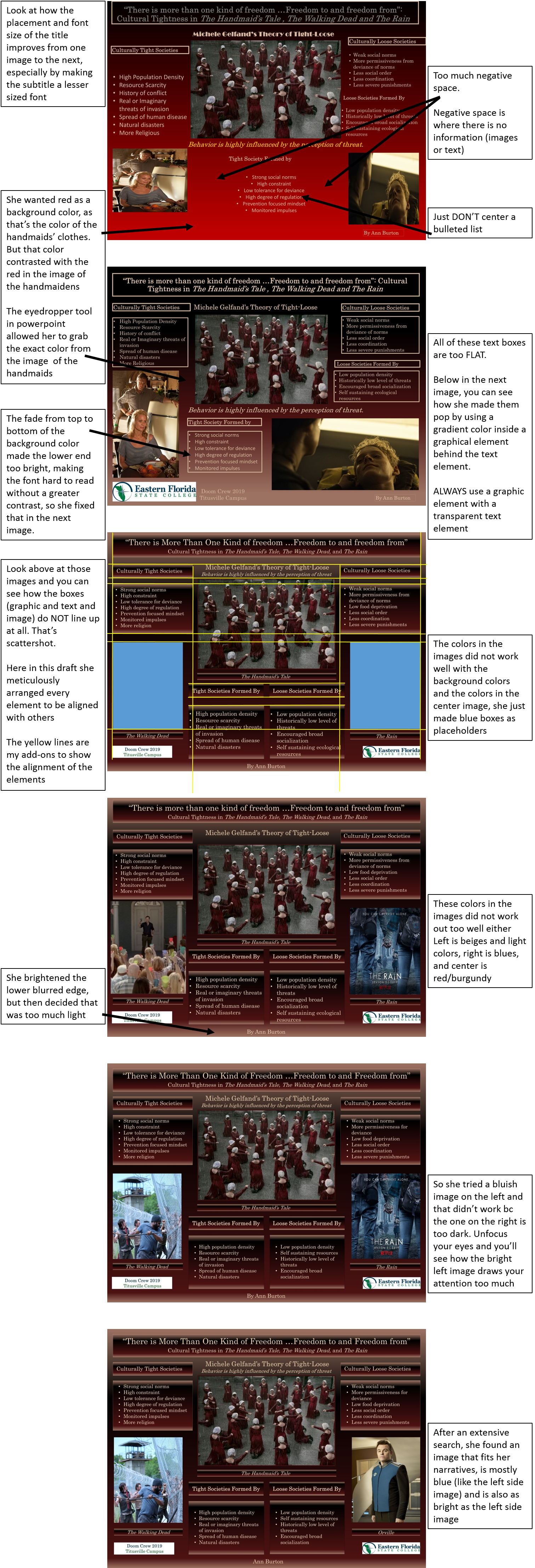
- In Ann's Progression, below, she desperately wanted the phrase "Behavior is highly influenced by the perception of threat"
- It doesn't seem to work but she really really wants it; by the fourth draft, and the phrase just being clunky, it finally vanishes from the poster.
- She let it go.
- In the fifth draft she had an insight as to where it could properly go.
Examples of Abstracted concepts
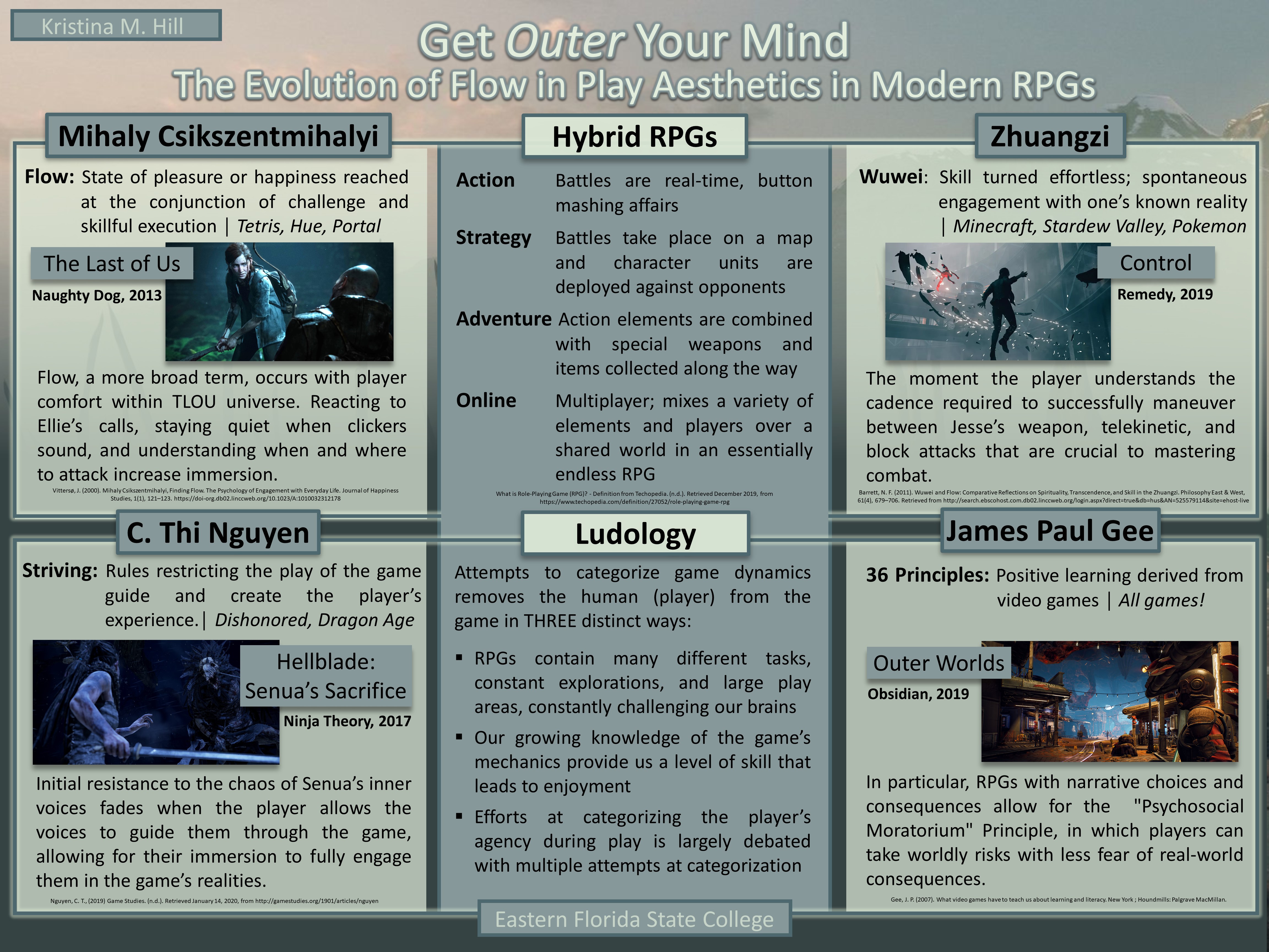
- Kristina's Angular Order.
- The angles are recursive across layers


Constantly revising/tweaking
- Making a good poster depends on tweaking every single aspect of the poster, down to the pixel movement of elements.
- This is an animation of Ann's first draft transitioning to the final version.

- Below, closely look at the intricate changes that transformed the first draft to the final draft

Resources
- Choose images
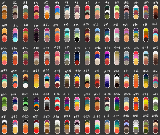
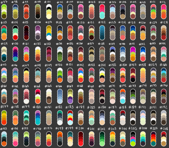
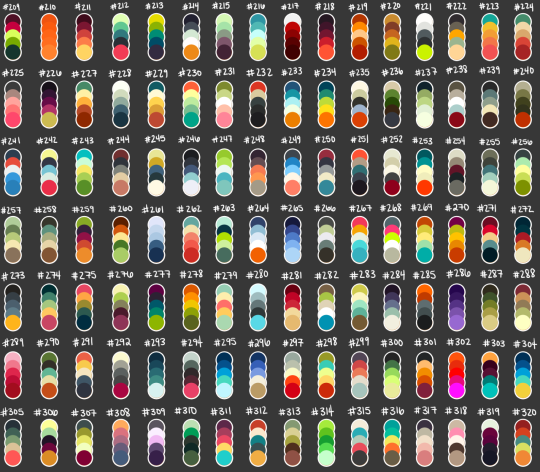
- Choose a color scheme from the images
- Once you select a color scheme, download the image it's on, place the image in your power point, and you can use the eyedropper to select the color.


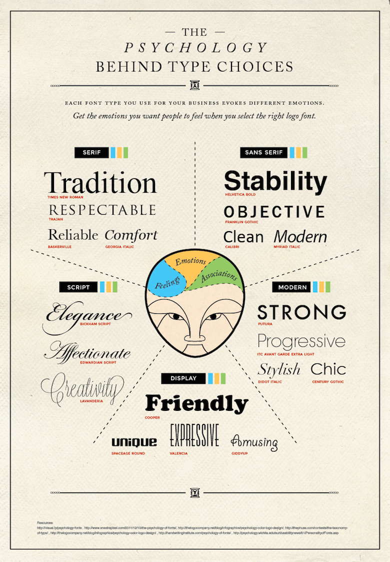
- Choose font types
The Poster Template
- Do not-- Do Not-- DO NOT ever use a template that power point provides.
- DON'T!
- EVER!
- (not kidding, seriously just never)
- Here's your template:
- In powerpoint, set your blank slide size to 48" wide and 36" high.
- (If you have an older Power point program that will not enlarge to that size, use 36" x 27")
Poster Examples
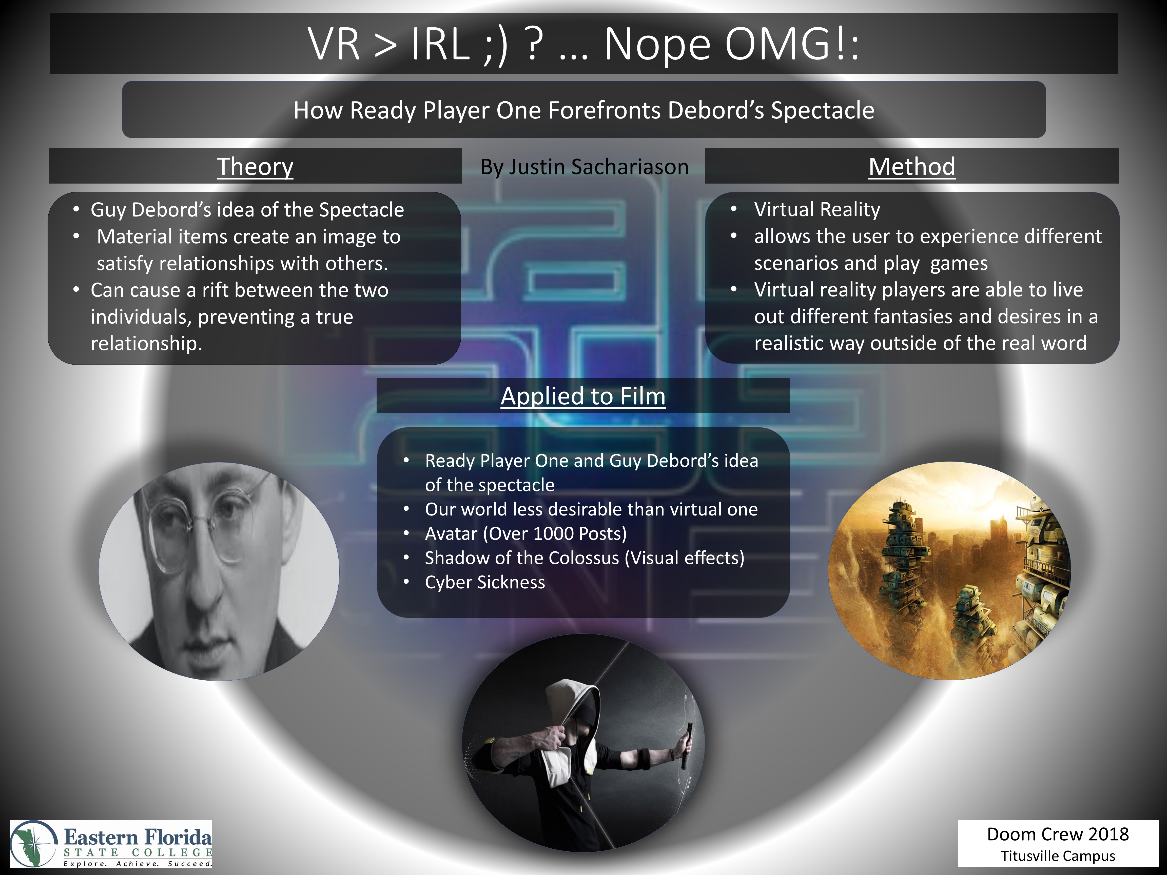
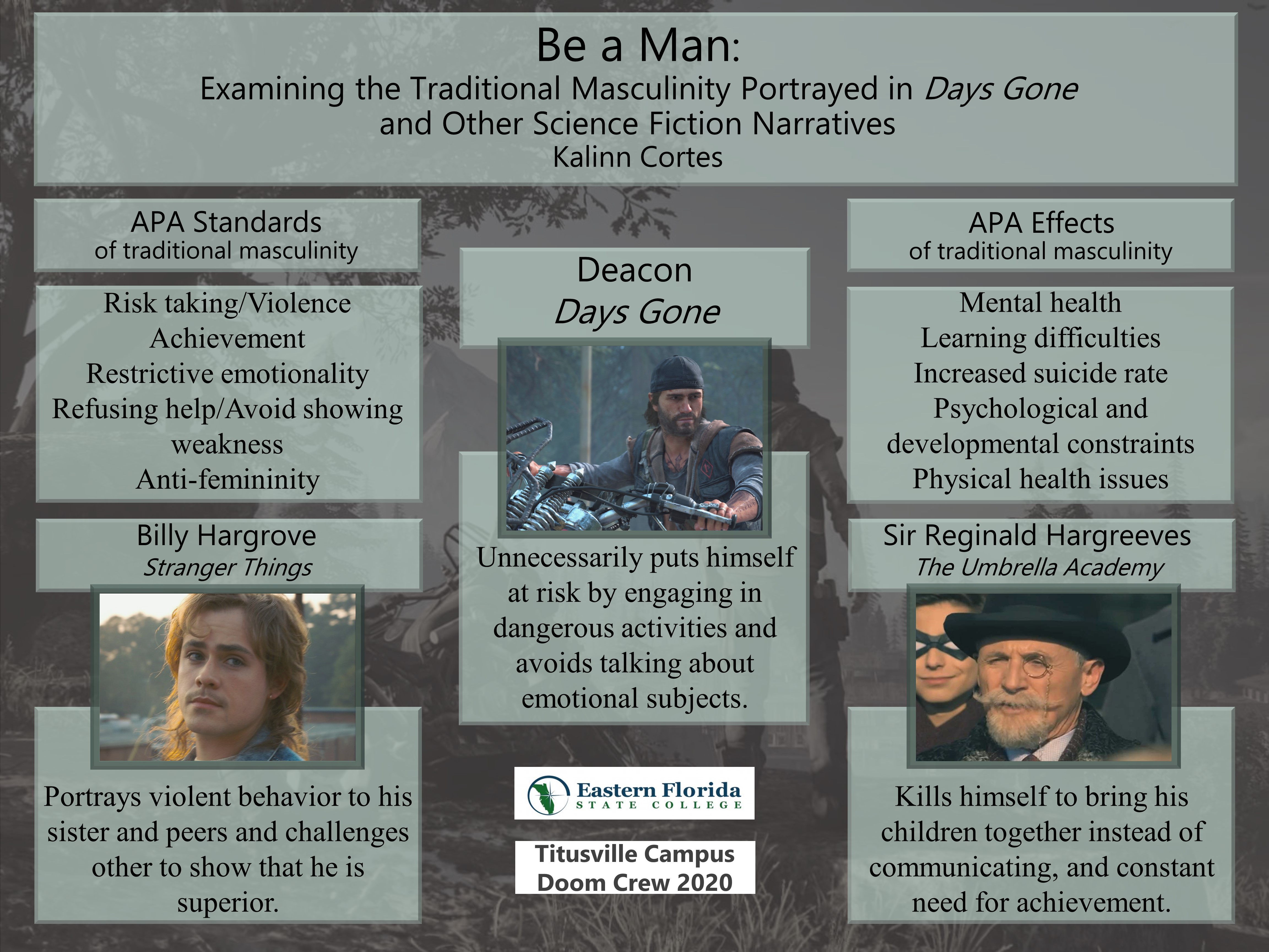
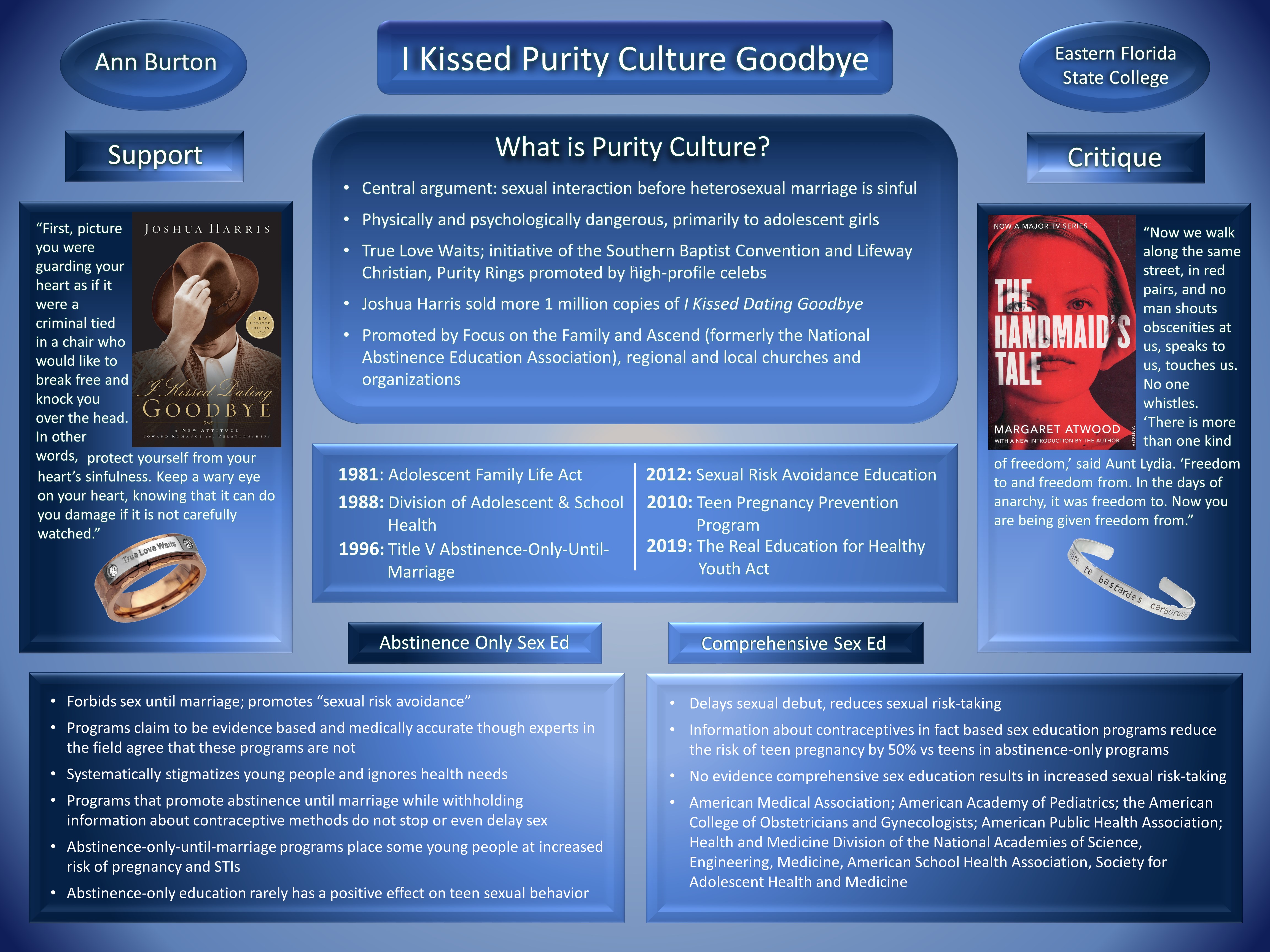
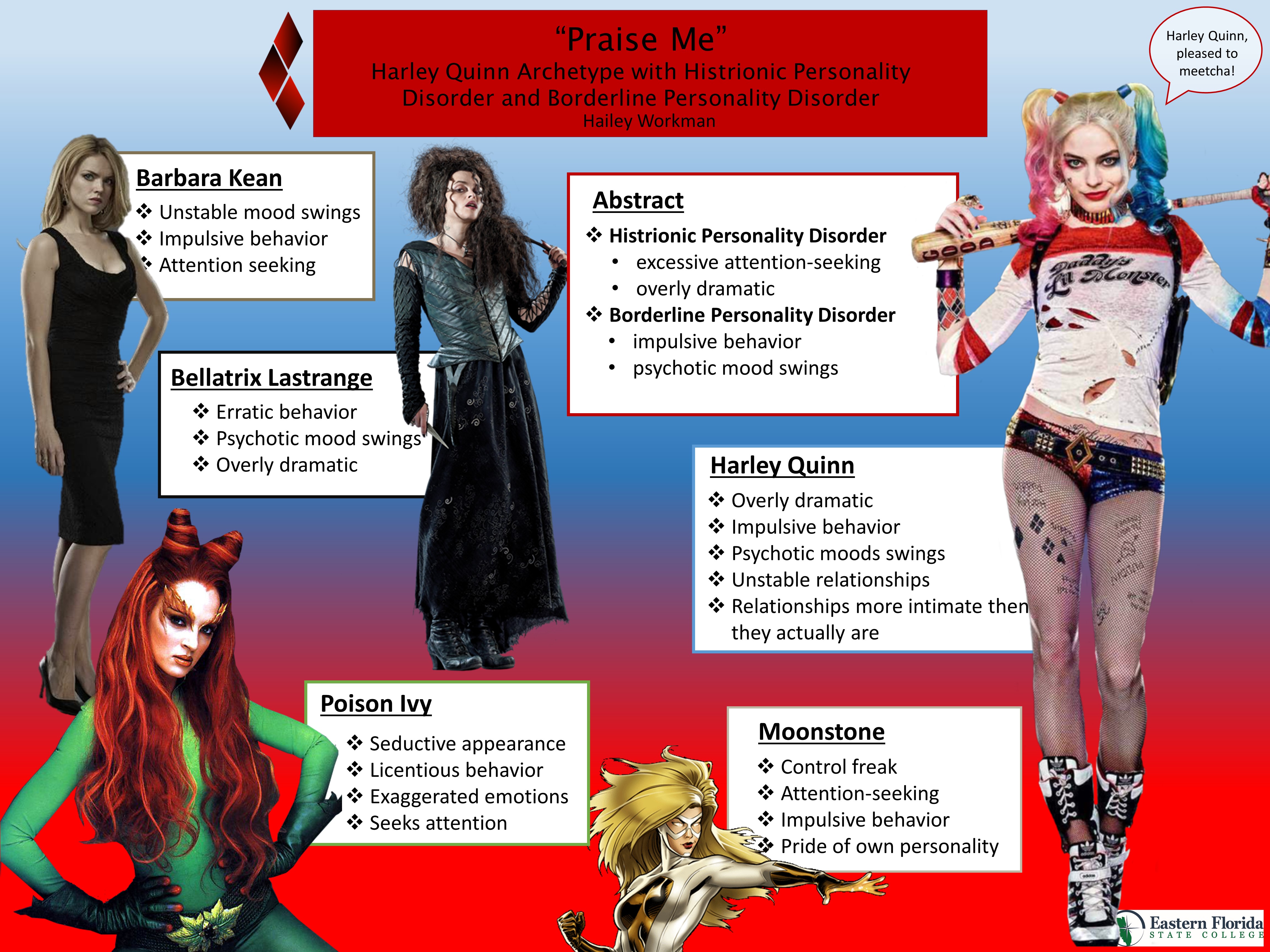
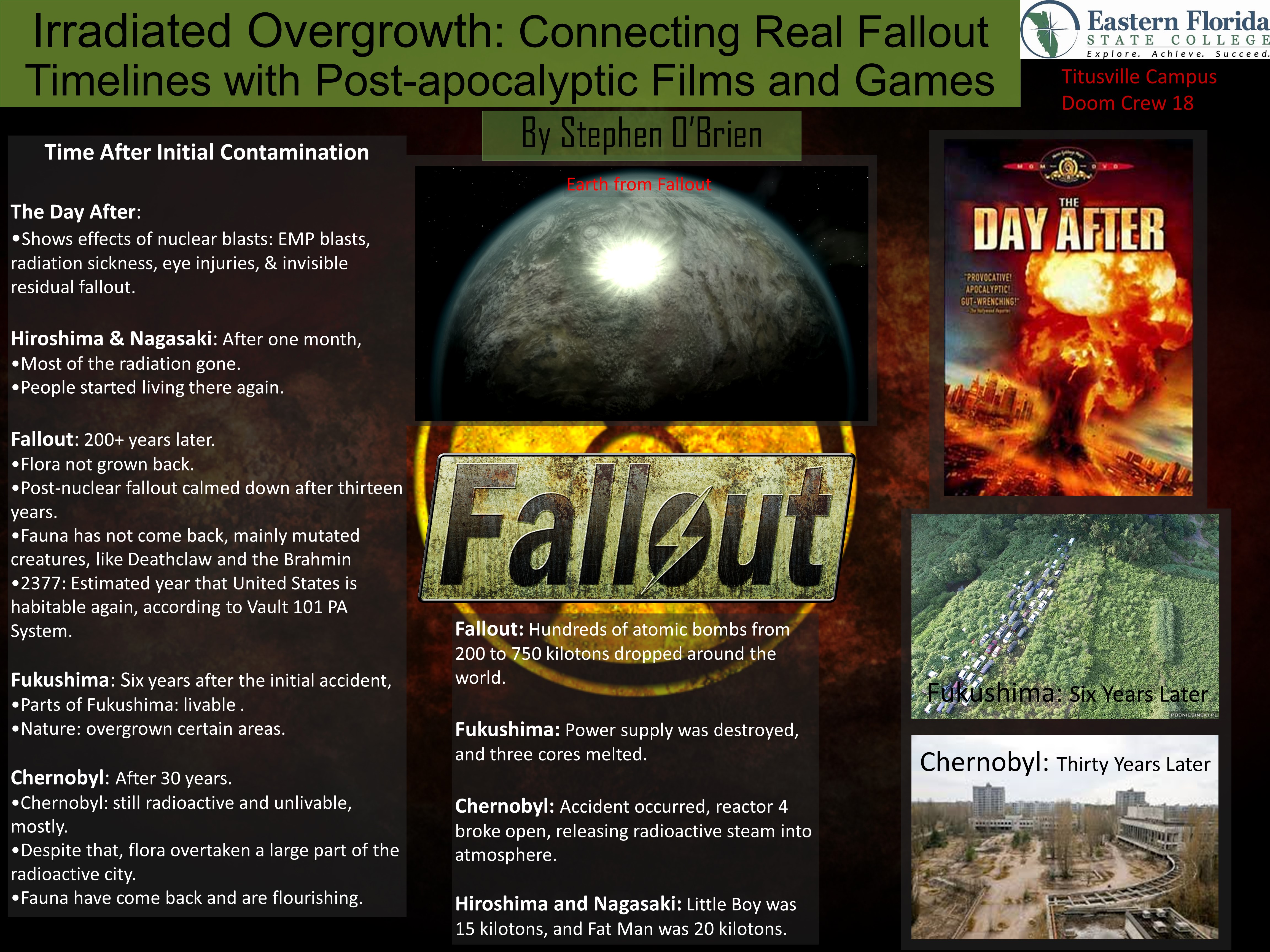
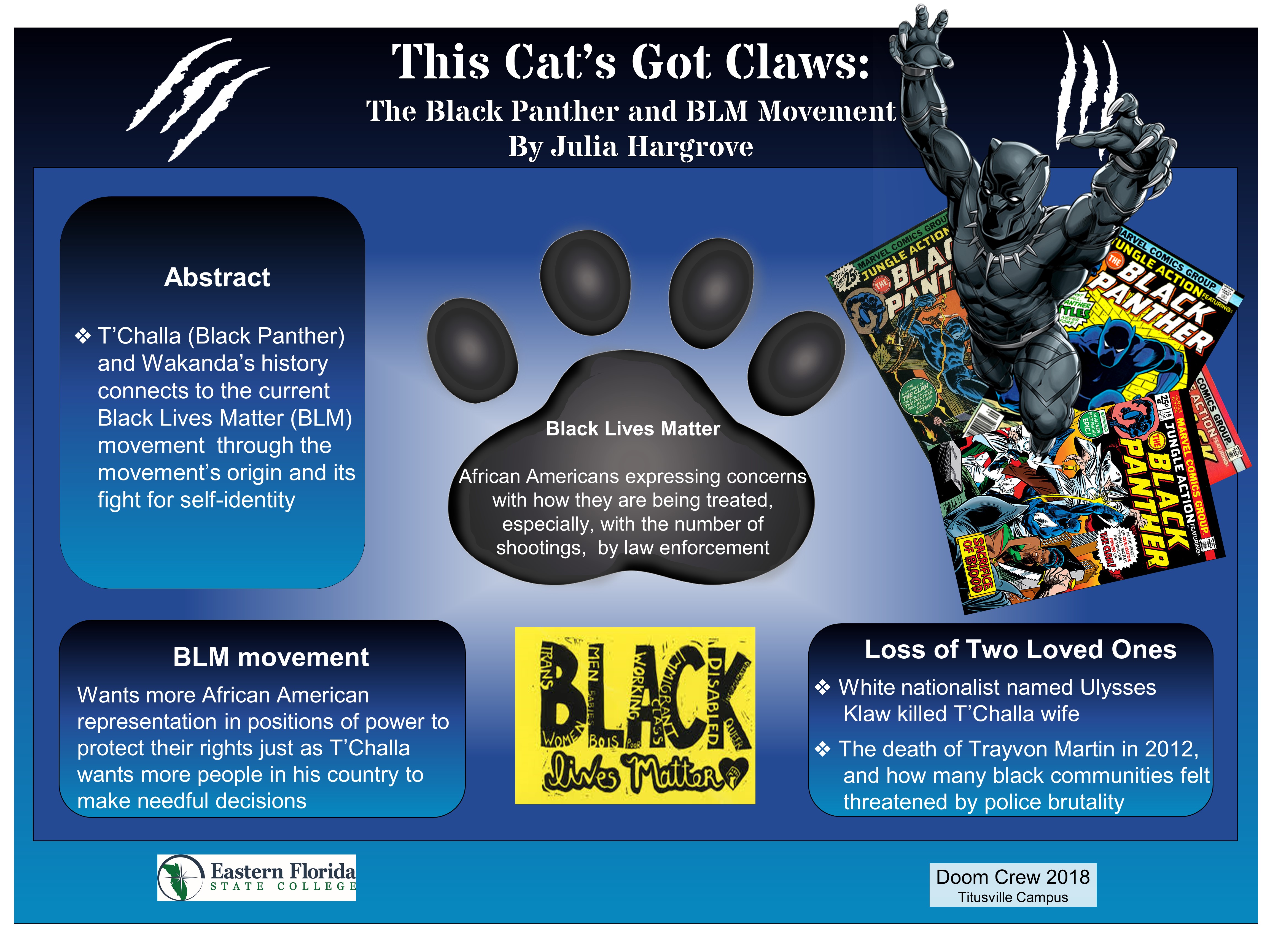
Example 1

Example 2

Example 3

Example 4

Example 5

Example 6

Example 7

Example 8
