Home / Comp 2 / Design a Pitchdeck
Level 8
Design a Pitchdeck
Warp to...
This page is still being developed; alert me to problems
General Guidlines
- Structure
- A Title Page will be the first page, and a Works Cited page will be the last page
- Cover all parts of the Term paper structure
- Introduction
- Summary of Film
- Method
- The Five Analysis papers (Theories/ Devices)
- at least three slides per small paper
- Meaning, one slide for the theory, one slide for the quote in the theory, and one for the second paragraph on how the theory applies to the narrative
- Conclusion
- Works Cited
- Words per frame
- No less than 5 words; no more than 30 words
- Bullets
- Only use bullets if you have more than one item in a list
- Do not center the text with bullets; bullets should be vertically in a line.
- DO NOT use hyphens as bullets: Use hyphens only to connect two words
- Quotes
- Use all five quotes from the Theory parts of your MLA paper
- ONLY have your intro sentence and the quote on these slides.
- Read to us that intro sentence and quote immediately.
- Works Cited
- Need 5 sources in Works Cited (those from the small theory papers)
- Cram Works Cited onto one slide. Do not worry about using hanging indents
- For the Works Cited page, ignore the 3x3 post-it rule (see below)
- No full sentences
- Use fragmented bullet points
- (except for quote slides, which need to be full sentences and quotes)
- Table of contents
- Must have a dynamic table of contents
- Font sizes and colors
- 2/2 rule
- At all times try to restrict font types to one or two types throughot the powerpoint
- At all times try to restrict color of fonts to one or two colors throughout the powerpoint
- Images
- Images must pertain to the subject or theory of the slide
- Every frame must have one image, either as part of the template or as an embedded image.
- Do not use the same image for every slide; if your template is the same image, you'll need unique images for each slide
- Sound effects
- None. Don't use them.
- You may use videos with sound
- Spelling
- Spelling errors for words that powerpoint would have caught with its spellchecker
- Clarity of text
- Post-It Note Test
- Hold a 3" x 3" Post-It note at arm's length and step back from your PC until the Post-It is the same size as the screen. If you cannot read the screen clearly, the font size or font color (compared to the background) needs changed.
- Post-It Note Test
Design 101: The Pitchdeck
- The KEY to a good Pitchdeck is movement.
- It's all about movement.
- "Movement is life" --World War Z
- People will last only about 4 seconds waiting for a website to load
- if a website doesn't load by then, they'll move on.
- Movement has to happen every 5 - 10 seconds in your presentation.
- Text appears/disappears or fades in/ fades out
- Images appear/disappear or fades in/ fades out
- Control the flow of the whole, and don't make it obvious slides have changed.
- Traditional powerpoints have each slide distinct from each other, with subheads on the slide and lists of bullets or tables/graphs.
- Traditonally then, every click brings up a new slide.
- Do not let your viewer know that any slide has changed to a new slide.
- There are subtle ways to do this:
- Images can overlay images (or images just disappear without the slide changing)
- Text and graphics overlay previous text and graphics (or the text just disappear without the slide changing)
- A background can morph into a new background without changing the slide.
- See how the "slides" in this pitchdeck example mostly slide so effortlessly that it's difficult for a viewing audience to discern where and when the slide changes occur.
- There are 170 movements in this example and only 31 slides
- This example came from a conference presentation of 15 minutes in length.
- 170 movements / 15 minutes = ~11 movement per minute, or one movement every 5.5 seconds
- Control the flow of words on screen
- No more than 30 words put on screen at any time
- Don't saturate your viewer with text; control text flow.
- All text (except quotes) must be bulleted and fragmented
- No full sentences
- Bulleted information must balance on a thin wire between explanatory and not being tediously too detailed
- Have an image on every slide
- Images need to ADD to the information on the screen, not just be interesting things to look at.
Stylesheet
- Layout and Design begins with a style sheet
- what images you'll use
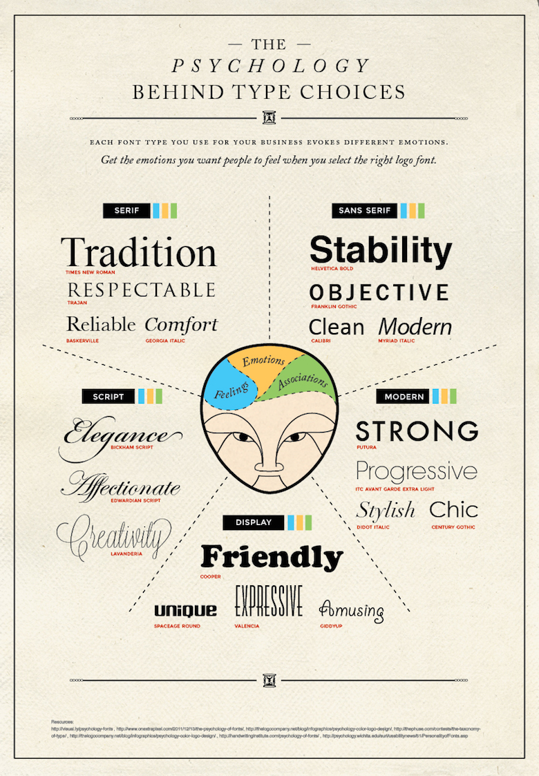
- What font types
- What font colors
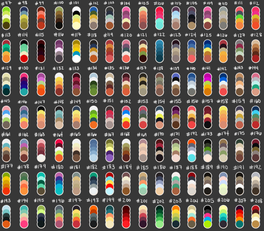
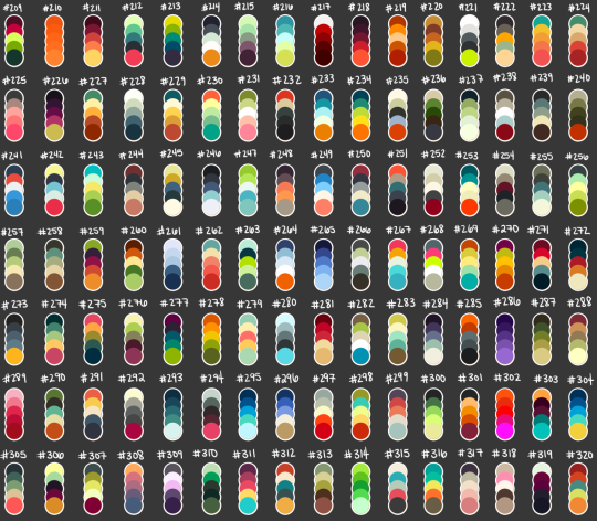
- what color pallete for the whole pitchdeck.
- The stylesheet is a list of conditions that you create, and from which you can not deviate.
- Layout and Design is NEVER about what looks cool.
- The overarching principle for a pitchdeck should be reflective of the tone, mood, theme, and style of the narrative you are discussing
- Every element (text, image and graphic) must have a REASON for its placement, orientation, color, and alignment, and that reason must relate to the overall principle of your design.
- You'll need an abstracted overarching concept to be the arbiter of all your creative decisions.
- The possibilites of design are limitless, and giving examples may too easily suggest you are to use template as an example.
- The following example, or any variation of it, cannot be used in your pitchdeck
- If my film was Fellowship of the Ring, I might opt to use a map of Middle Earth (as the map is a prevalent motif in the books and films). I can imagine a pitchdeck that starts with the map (but with my added annotations on the map indicating the areas to be covered -- the items in the outline for the pitchdeck). I could have each slide zoom in on that map to the appropriate note and then switch to slides to cover that part of the pitchdeck, such as a theory, its quote, and the application of the theory to the film. Then, the next slide would be the whole map again, and from that zoom in to another part of the map that then reveals the next item in the outline.
- Above all, learn to let go. Just because you initially found a font type or image or layout enticing does NOT mean the pitchdeck should stay that way.
- Intuition is never part of the process in layout and design.
Use a Table of Contents on every slide
- Use a flowing table of contents (TOC) for all presentations.
- The TOC is on every page after the title and informs the viewer of
- What was discussed
- What is being discussed
- And what is next
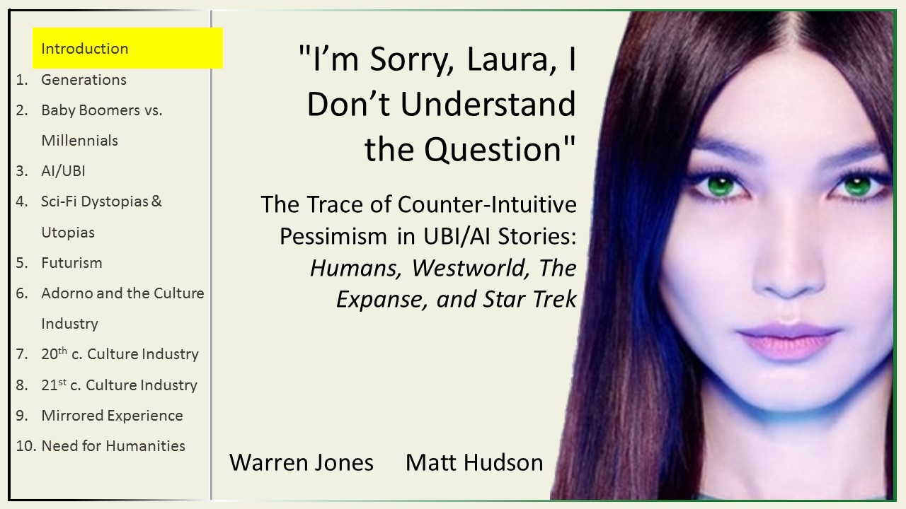
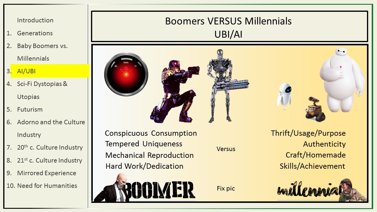
- Left Side TOC
-
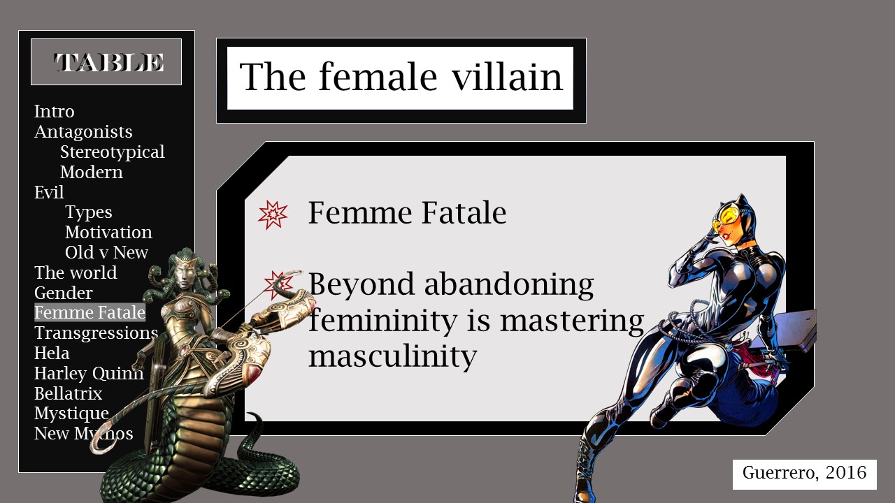
- Enumerated Left Side TOC on title slide
-
- Enumerated Left Side TOC in presentation
-
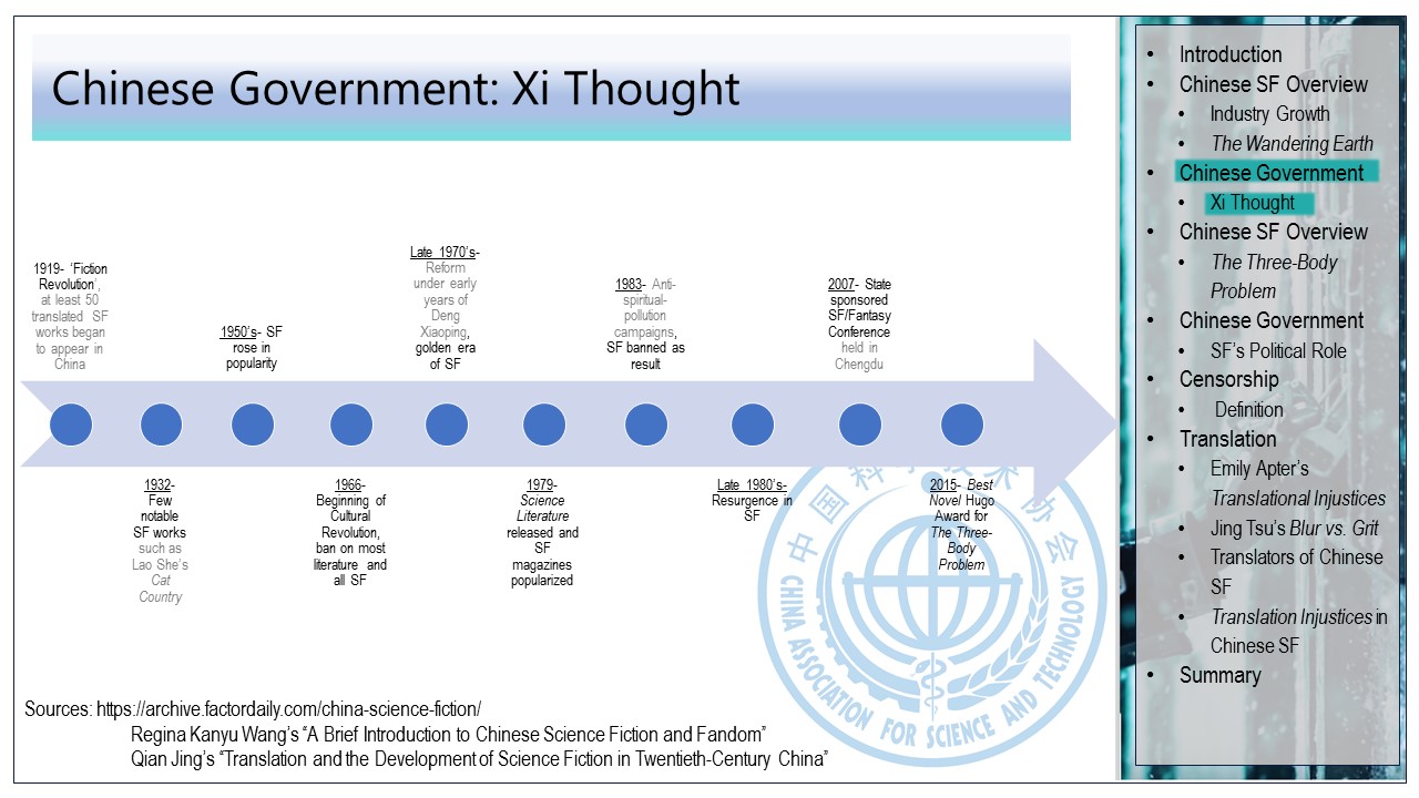
- Right Side TOC
- (Layout: Usually TOCs are on the left; she chose right-side because many asian languages are traditionally written top-down right-to-left)
- Bottom TOC / Title slide
-
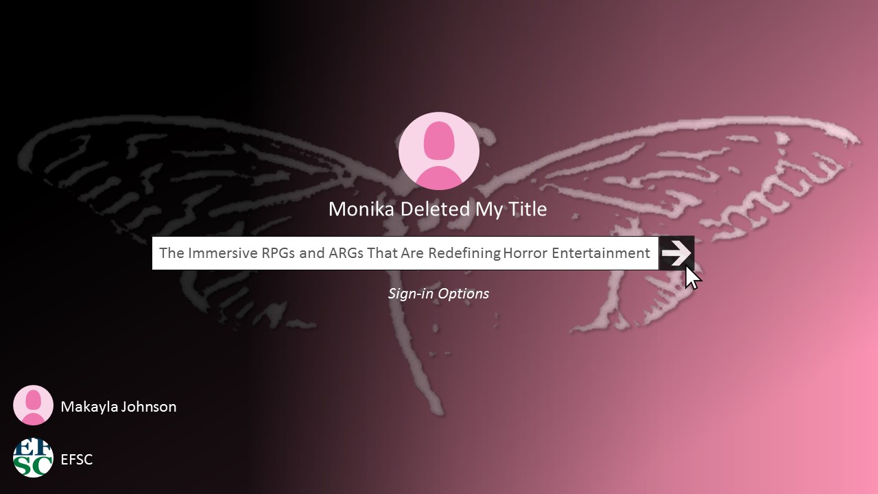
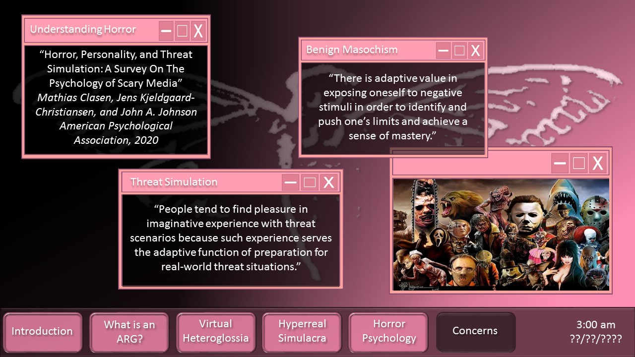
- Bottom TOC in presentation
- (Creates a conceit of a desktop and uses the "taskbar" as a TOC)
-
Resources
- Choose images
- Choose a color scheme from the images
- Choose font types
